Table of Contents
Introduction

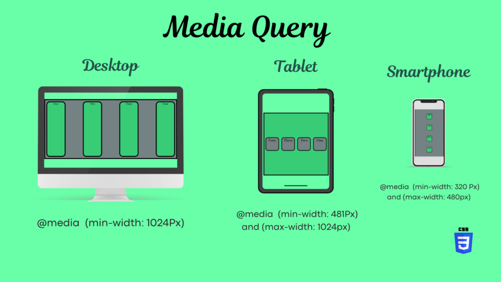
In modern web development, responsiveness is key to providing a seamless user experience across devices. With the rise of mobile and tablet browsing, ensuring your web application adapts to various screen sizes is essential. In the Svelte ecosystem, handling responsive design has become much easier with the Svelte Media Query Store package. This lightweight library provides reactive stores for managing CSS media queries and breakpoints, making your Svelte app adaptable to different device widths.
In this post, we’ll explore how to use the Svelte Media Query Store to manage breakpoints and media queries, empowering you to build responsive Svelte applications easily.
What is Svelte Media Query Store?
The Svelte Media Query Store is a library that provides reactive stores to monitor and react to CSS media queries. It simplifies managing breakpoints and screen size changes, allowing developers to write responsive components in a Svelte app. Whether you need to detect if a user is on a mobile device or adjust layouts for wider screens, this tool efficiently manages these states.
Key Features:
- CSS Media Queries Matcher: Allows you to define custom media queries (e.g.,
(min-width: 800px)) and returns a readable store to track the matching state. - Breakpoint Matcher: Helps you monitor screen size changes by defining breakpoints and mapping them to media queries.
How to Install Svelte Media Query Store
To get started with the Svelte Media Query Store, first, you need to install the package via npm:
npm i svelte-media-query-store
Once installed, you can import the relevant utilities into your Svelte component or store file.
Using Svelte Media Query Store for Breakpoint Management
Let’s start with an example of how you can manage breakpoints in a Svelte app. Suppose you want to detect common Tailwind CSS breakpoints like sm, md, lg, xl, and 2xl.
Breakpoint Matcher Example:
svelteCopy code<script lang="ts">
  import { breakpointMatcher } from 'svelte-media-query-store';

  const breakpoints = {
    'sm': '(min-width: 640px)',
    'md': '(min-width: 768px)',
    'lg': '(min-width: 1024px)',
    'xl': '(min-width: 1280px)',
    '2xl': '(min-width: 1536px)'
  };

  const currentBreakpointMatcher = breakpointMatcher(breakpoints);
</script>

<h2>Current Breakpoint: <b>{ $currentBreakpointMatcher }</b></h2>
In the example above, we’ve created a currentBreakpointMatcher store that reacts to changes in the screen width. As the browser’s width changes, this store will update automatically to reflect the active breakpoint.
Using CSS Media Queries Matcher
If you need to detect a specific screen width, such as checking if the screen width is below 600px (typically for mobile), you can use the mediaQueryStore function.
Media Query Example:
svelteCopy code<script lang="ts">
  import { mediaQueryStore } from 'svelte-media-query-store';

  const isMobile = mediaQueryStore("(max-width: 600px)");
</script>

<h2>Is Mobile: <b>{ $isMobile }</b></h2>
This example demonstrates how the isMobile store will automatically update based on whether the screen width is smaller than 600px.
Reactive Design with Svelte Media Query Store
The true power of Svelte Media Query Store comes when combining it with Svelte’s reactive stores. By using the library’s features, you can create dynamic and responsive components that react to screen size changes without the need for bulky CSS or JavaScript.
Here’s a more advanced example where we conditionally render components based on the active breakpoint:
svelteCopy code<script lang="ts">
  import { derived } from 'svelte/store';
  import { breakpointMatcher } from 'svelte-media-query-store';

  const breakpoints = {
    'sm': '(min-width: 640px)',
    'md': '(min-width: 768px)',
    'lg': '(min-width: 1024px)',
    'xl': '(min-width: 1280px)'
  };

  const currentBreakpointMatcher = breakpointMatcher(breakpoints);

  const isXl = derived(currentBreakpointMatcher, ($currentBreakpointMatcher) => {
    return $currentBreakpointMatcher === 'xl';
  });
</script>

<h2>{ $isXl ? 'This is an XL Screen' : 'Not an XL Screen' }</h2>
In this example, we use the derived store to create a reactive condition that checks if the current screen width is within the xl breakpoint. The text displayed will change depending on the screen size.
Why Use Svelte Media Query Store?
The Svelte Media Query Store package offers several benefits for developers looking to create responsive applications:
- Ease of Use: You can easily manage screen breakpoints and media queries without needing to constantly write CSS.
- Reactivity: The stores provided by this package are fully reactive, meaning they automatically update your UI when the browser size changes.
- Efficiency: Instead of hardcoding breakpoints into your CSS or JavaScript, you can manage them dynamically through Svelte’s store system.
Conclusion
Responsive design is crucial in modern web development, and the Svelte Media Query Store offers an elegant and reactive solution for handling CSS media queries and breakpoints. Whether you’re building complex UIs or just need simple media query handling, this package can help you achieve a seamless responsive experience in your Svelte applications.
If you haven’t tried it yet, install the Svelte Media Query Store and start building reactive, responsive web apps today.
Start using the Svelte Media Query Store by visiting the npm package today or explore the GitHub repository for more information!
